This week, Dartmouth is introducing a strategic communications framework and the first phase of an updated visual identity system to enhance how the institution presents itself to the world and capitalize on the qualities that celebrate Dartmouth’s distinctive appeal. The forward-looking messaging and design embrace the College’s singular identity and rich legacy.
“Dartmouth is recognized around the world as one of the great institutions of higher education, and we must have a clear, consistent brand identity,” says President Phil Hanlon ’77. “It is essential that we speak with one bold voice.”
The foundation for the work comes from strategic messaging that captures Dartmouth’s unique characteristics. For more than a year, members of the community—faculty, staff, alumni, students, parents, and trustees—have worked to articulate the characteristics that best describe Dartmouth. Justin Anderson, vice president for communications, led an initiative, working with communications professionals and other representatives from across the institution, to translate the messaging into a new visual identity system.
“The messaging work identified five qualities that capture the institution and will allow all of us to tell Dartmouth’s story with conviction and pride,” says Anderson.
The pillars of the strategic framework are:
- Liberal arts are at the very core of the institution and infuse a culture of critical thinking, creativity, collaboration, and leadership in a complex world.
- The teacher-scholar model is Dartmouth’s greatest distinction and the driver of the finest educational experience anywhere.
- Dartmouth is a base camp to the world, a vibrant, tight-knit community from which students and faculty venture forth, ascending to new heights.
- Dartmouth has an adventuresome spirit that embraces the unknown, invites fearlessness and teamwork, and radiates tenacity, curiosity, and life-changing ideas.
- Dartmouth has a profound sense of place. From the Green to the river and the mountains beyond, Dartmouth grounds and transforms all who experience the institution.
A Graphic Identity for the Digital Age
In communicating the strategic messages, Anderson says it was clear that Dartmouth’s visual presentation—on websites and printed materials—had become inconsistent and fragmented and in need of updating.
“We need a consistent graphic identity crafted for the digital age, one that communicates as well on, say, letterhead as it does on Instagram,” he says.
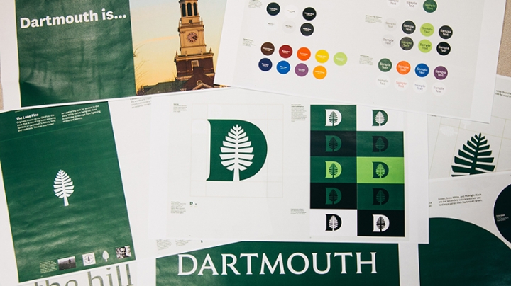
The new graphic elements include four key items: a Dartmouth wordmark, which is the typographic treatment of the Dartmouth name; a custom-made typeface; a redesigned “lone pine”; and an icon that combines the lone pine with the letter D. Additionally, there is a new palette of colors to complement the traditional Dartmouth Green color, as well as new icons for use in social media, all of which will better communicate the Dartmouth identity, says Anderson.
The new lone pine design, like the old one, was inspired by the tree that once stood on the hill near Shattuck Observatory and was a gathering place for seniors in the 1800s. “The lone pine is a Dartmouth icon,” says Anderson. “The refined version gives us flexibility to use it more often, in different sizes, and in multiple formats.”
The updated wordmark and the D-pine render those icons suitable for digital media, which was an important consideration. A guide to the new identity system has been created to facilitate implementation and use across campus.
Introducing the New System
The changes will be made available over time, beginning with the Dartmouth wordmark and D-pine appearing throughout the College’s website, on Dartmouth’s social media platforms, and on stationery. In time, more elements will be introduced on the website and elsewhere, including the graduate and professional school sites.
Anderson led a committee, with representation from across the institution, to work on the graphic identity system. The group worked with the graphic design agency OCD|Original Champions of Design, based in New York City, to conduct a comprehensive review of Dartmouth’s history, traditions, and design legacy, informed by the new strategic framework, in order to create a flexible identity system for the future that respects Dartmouth’s rich past.
“The updated identity honors a historic brand and aligns visual messaging across the institution for maximum recognition and impact,” says Kevin Lane Keller, the E.B. Osborn Professor of Marketing at the Tuck School of Business and a member of the committee. “Additionally, the alignment reinforces and signals a shared sense of purpose and being part of a united entity: Dartmouth.”
The new Dartmouth wordmark and a custom typeface called “Dartmouth Ruzicka” are based on the work of the late Rudolph Ruzicka, a typeface and book designer and longtime resident of Hanover whose book Studies in Type Design was published by the Dartmouth Library in 1968. The typeface on which the wordmark is based was used on the College’s bicentennial seal and plaque in 1969 and on the design of the Dartmouth Medal, an American Library Association award first given out in 1973 and still awarded today.
The existing Dartmouth Green color is the focal point of the color system, with new secondary colors derived from traditions that tell the story of the institution and its environment. The new colors include Bonfire Red, River Blue, and Summer Yellow.
Redesigned stationery templates for printed materials, including business cards, letterhead, envelopes, and note cards, will be available to order on the Dartmouth Printing and Mailing Services website. The Dartmouth Visual Identity website provides information and guidelines for use.
For information about accessing and using the components of the new visual identity, contact Richard Clark, senior graphic designer in the Office of Communications.
In addition to Anderson and Keller, the Visual Identity Steering Committee members were Martha Austin, associate provost; Amy Baker, trademark licensing administrator, Office of the General Counsel; Lisa Celone, Campus Services director of communications; Lee Coffin, vice provost for enrollment and dean of admissions and financial aid; Gina des Cognets, Tuck ’01, chief of staff and executive director at Tuck; Karen Endicott, senior director of communications, Thayer School of Engineering; Laura Hercod, chief of staff to the president; Derik Hertel, director of communications and marketing, Geisel School of Medicine; Sam Hopkins, senior associate athletics director for external relations; Ann Root Keith, chief operating officer for advancement; Jane Seibel, assistant dean of recruiting and diversity, and communications manager, School of Graduate and Advanced Studies; and Barbara Will, associate dean of arts and humanities.